
Hi blog. Sorry we haven't spoken in a while. Had a busy Christmas!
I've seen a few storm trooper redesigns kicking around the web, and I wanted to have a go at one of my own. Growing up, I always really liked the scout troopers who wore slightly different helmets and rode around on hover bikes - badass. Here's my shot at a new one:
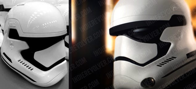
 And here's the original:

I love the leaked redesign of the helmet which has been floating around on the internet for a while. I think it is a great evolution of the design:
A lot of the redesigned troopers I've seen which have been fan design (although artistically very well executed) don't scream "new" to me. So I guess the question is, what makes a design seem modern?
Although a lot of what looks pretty is subjective, but I think we can look at one major factor which dictates the date of a design design - materials (+ construction).
Scientific progress often means discovery of new materials. This in turn leads to advancement in manufacturing methods and the ability to produce new looking things. A good example of this is the use of plywood, plastics and fiberglass in furniture after the second world war. Furniture could be made in new and exciting ways, and there was a renaissance in design language. Charles + Ray Eames etc..
More recently, the Laferrari uses modern manufacturing techniques to make shapes which would have been impossible 10 years ago. Super sharp undercuts transition to long graceful undercuts with ease.
So, looking at the new helmet design, how does it succeed? I think one element stands out. The large curved glass visor, which seamlessly transitions into the mouth piece. The black expanse supports a floating white nose section, hinting at inherent strength in the glass. The rest of the helmet is sleek, and singular in form, suggesting small tolerance manufacturing techniques i.e. high-techness.
Nice.
I've seen a few storm trooper redesigns kicking around the web, and I wanted to have a go at one of my own. Growing up, I always really liked the scout troopers who wore slightly different helmets and rode around on hover bikes - badass. Here's my shot at a new one:
I love the leaked redesign of the helmet which has been floating around on the internet for a while. I think it is a great evolution of the design:
A lot of the redesigned troopers I've seen which have been fan design (although artistically very well executed) don't scream "new" to me. So I guess the question is, what makes a design seem modern?
Although a lot of what looks pretty is subjective, but I think we can look at one major factor which dictates the date of a design design - materials (+ construction).
Scientific progress often means discovery of new materials. This in turn leads to advancement in manufacturing methods and the ability to produce new looking things. A good example of this is the use of plywood, plastics and fiberglass in furniture after the second world war. Furniture could be made in new and exciting ways, and there was a renaissance in design language. Charles + Ray Eames etc..
More recently, the Laferrari uses modern manufacturing techniques to make shapes which would have been impossible 10 years ago. Super sharp undercuts transition to long graceful undercuts with ease.
So, looking at the new helmet design, how does it succeed? I think one element stands out. The large curved glass visor, which seamlessly transitions into the mouth piece. The black expanse supports a floating white nose section, hinting at inherent strength in the glass. The rest of the helmet is sleek, and singular in form, suggesting small tolerance manufacturing techniques i.e. high-techness.
Nice.
I like your over all design minus the "sun visor" part. It makes it a bit too much like a dirt bike helm, which WAS one of the main inspirations for the original. If I remember this correctly, the 2 inspirations with dirt bike and the ideology of the kazekami pilots (not their actual helms) thus having "blinders" on the side of the helm for an infesis on needing to just go in one direction. The blinders helped to keep the original from looking too much like a dirt bike helmet in my opinion.
ReplyDeleteHowever, the rest of your design is great and it does feel more modern like the new TK helm design.
Ah, thanks. I really enjoy feedback like this! I hadn't realised that about the blinders on the sides, but I see exactly what you mean. If I revisit this I will definitely incorporate them!
ReplyDeleteThis is awesome, was it just a sketch or did you do it in CAD?
ReplyDeleteHeya Ryan, sorry about the late reply, I don't use this blog any more! It's just a sketch. No 3D involved. Glad you like it.
Delete